Custom Masks
A mask is the shape a card or token is cut to on the table: a rounded rectangle, a hexagon, a star, or any outline you draw. Alongside the built-in shapes, you can design your own reusable masks in the Mask Editor.
Custom masks are private to your account and can be applied to any card or token. Because a component only references a mask, editing the mask updates every component that uses it, everywhere it appears.
Opening the Mask Editor
Open your account menu (top right) and choose Mask Editor. The page has two parts: Built-in shapes (always available) and Your custom masks.
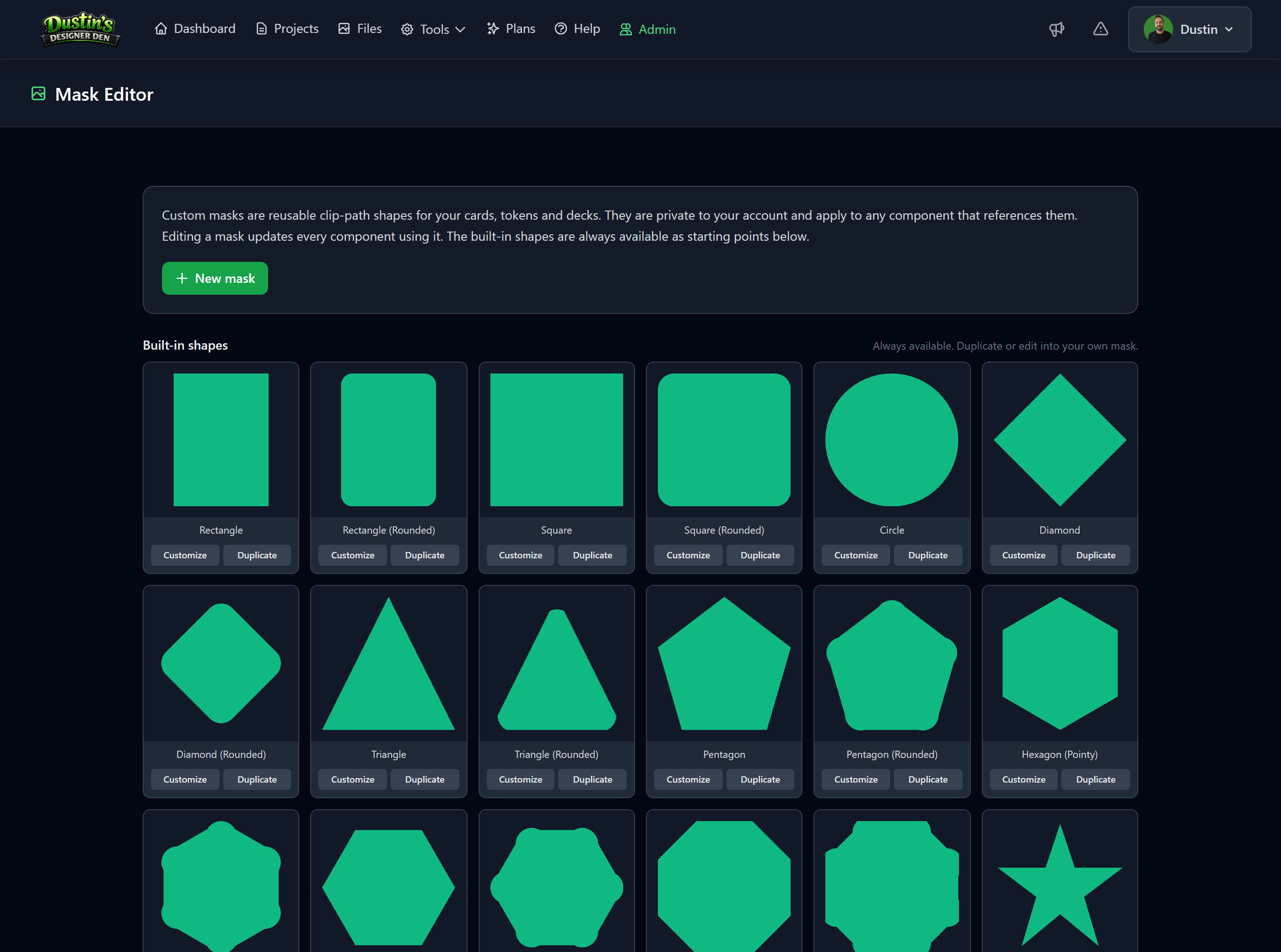
Built-in shapes as a starting point
The built-in shapes (Rectangle, Square, Circle, Diamond, Triangle, Pentagon, Hexagon, Octagon, Star, and their rounded variants) are always available and never change. From any built-in you can:
- Customize — open it in the editor and save it as a new mask of your own. The built-in itself is left untouched.
- Duplicate — copy it straight into your custom masks so you can tweak it.
Creating a mask
Click New mask (or Customize a built-in) to open the editor.
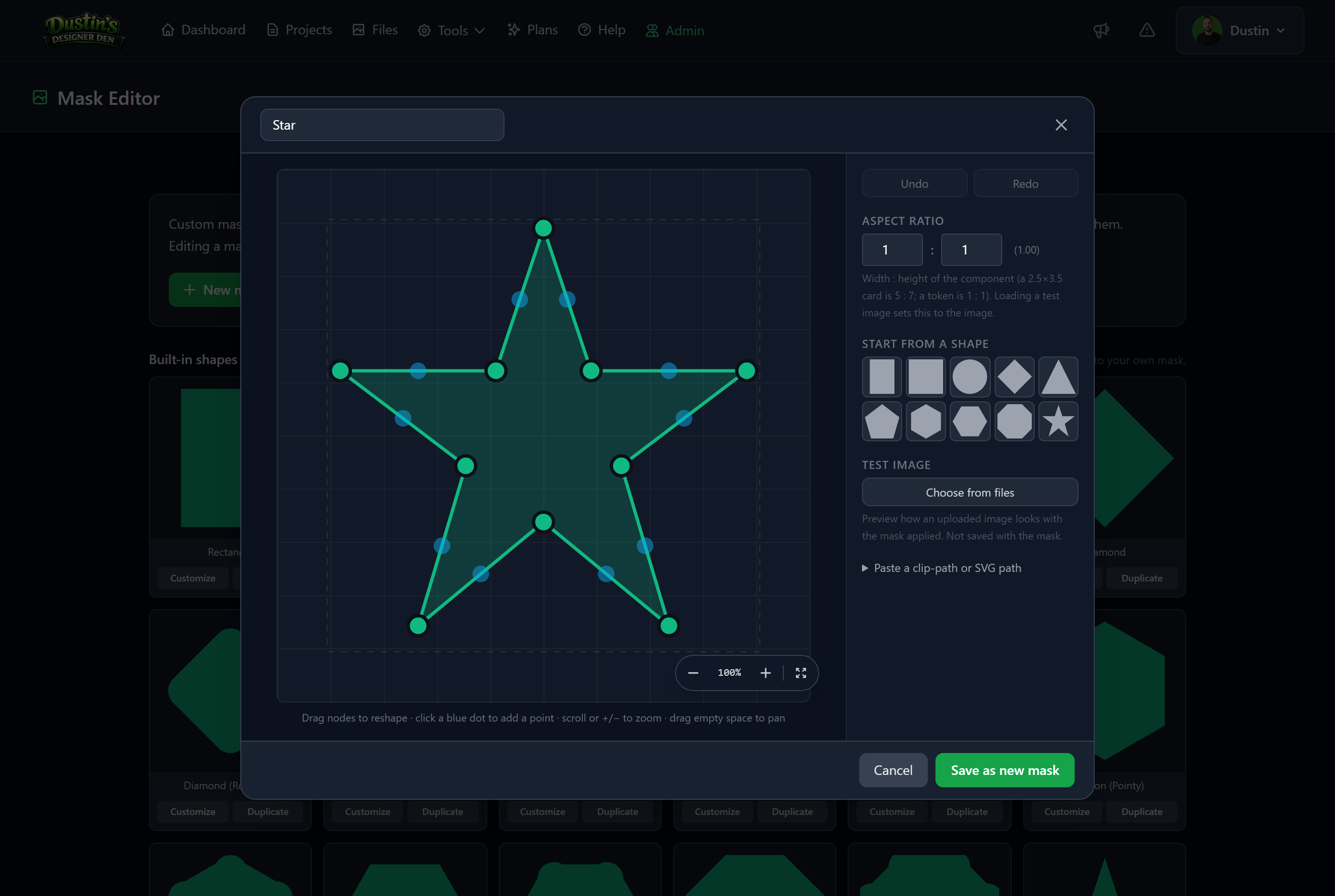
- Start from a shape: pick a preset in the right panel to drop in its outline, then reshape it.
- Move points: drag any node on the canvas. For precise placement, select a node and type its X / Y (0 to 1 across the box).
- Add a point: click a blue dot on an edge to insert a node there.
- Delete a point: select a node and click Delete node (a shape needs at least 3).
- Round corners: select a node and drag its Corner radius, or use Apply radius to all to round every corner evenly.
- Undo / Redo sit at the top of the panel.
- Zoom and pan: scroll or use the zoom controls to zoom, and drag empty space to pan. The reset button re-centers.
Give the mask a name at the top, then click Save as new mask (or Save changes when editing an existing one).
Aspect ratio
The Aspect ratio (width : height) tells the editor the proportions of the component the mask is for. A standard 2.5 by 3.5 inch card is 5 : 7; a token is 1 : 1. This is what makes a rectangle read as a card rather than a square. Loading a test image sets the aspect to match that image automatically.
Test image
Under Test image, choose an image from My Files to preview how real art looks inside the mask.
Note
The test image is only a preview. It is not saved with the mask, though loading it does set the aspect ratio to the image.
Paste a clip-path or SVG path
If you already have a shape, expand Paste a clip-path or SVG path and paste either a CSS polygon(...) value or an SVG path (M ... Z), then click Convert.
Note
A pasted SVG path is imported as-is and is not node-editable on the canvas. To change it, paste a new shape to replace it.
Applying a mask to a component
Masks are applied per component, wherever you set a shape:
- In the component editor or the new-component wizard, the Card Shape Mask dropdown (for cards) and the Token Shape dropdown (for tokens) list your custom masks right alongside the built-in shapes. Pick one and save.
Once applied, the mask shows everywhere the component appears: the playtest room, component thumbnails, the Deck & Stack Builder, and Print & Play PDFs. See Components and Component Types for where these settings live.
Tip
A deck or stack must be uniform in shape: every card in a deck shares one mask, and every token in a stack shares one shape. See the Deck & Stack Builder.
Flipping and asymmetric masks
If a mask is not symmetric (like a swoosh cut to one side), it is mirrored automatically when a card or deck is flipped, so the back lines up with the front instead of pointing the wrong way.
Editing and deleting
- Editing a mask updates every component that references it, everywhere, at once. There is no need to re-apply it.
- Deleting a mask unlinks it from the components using it: those cards go back to no mask, and those tokens go back to a circle. The delete prompt tells you how many components will be affected first.
Importing with masks (Dextrous, CSV, JSON)
Imports can apply your custom masks by name. If a shape or mask column in your import matches the name of one of your custom masks (case-insensitive), that component is set to use that mask automatically. This works for a card's mask column and a token's shape column.
Tip
Create the mask first with the exact name your import uses (for example, a Dextrous mask name), then run the import. See Dextrous Import.